Color Theory
“Experience teaches us that in visual perception there is a discrepancy between physical and psychic reality.”
Josef Albers
Chromatic interaction and its perceptual implications trigger a series of conscious and unconscious stimuli in our psycho-spatial relationship. Nevertheless, the multiplicity of factors governing this interaction, along with the vast body of studies on the subject, make it a broad and complex field.
There is no single color theory, but rather a set of approaches to color and its dynamics- most of them drawn from art history or physics (optics), contributed by diverse authors.
Color is the experience or chromatic impression produced in the observer’s brain when vision occurs through a color stimulus. Thus, color sensation is the result of a physiological process, so distant and near objects are distinguished through color perception. That is, thanks to the different color sensations, shapes can be distinguished and recognized. This optical phenomenon is called color perspective.
All hues or colors we perceive have three basic attributes:
Hue: (chroma by some authors): it is the color itself, the attribute that allows us to differentiate one color from another, which is why we can identify when a hue is green, violet, or orange.
Lightness: it is the amount of light that each color has (brightness/darkness) and can be distinguished in contrast to other colors. For example, yellow is lighter than blue, or green is lighter than brown. In short, lightness is the degree of closeness of a given color to white or black. We often call a hue “light red” when it is closer to white, or “dark red” when it is closer to black.
Saturation: it is, basically, the purity of a color, the amount of gray contained in a color at a given moment. The higher the percentage of gray present in a color, the lower its saturation or purity will be, and therefore it will appear dull or dirty. Conversely, when a color appears as pure as possible (with the least amount of gray present), its saturation will be higher.
Newton
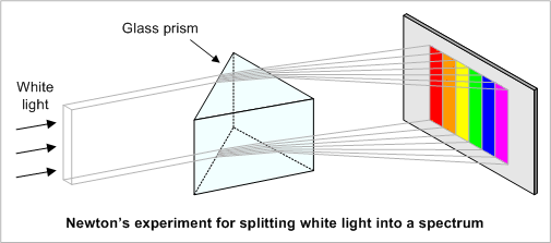
Our modern understanding of light and color begins with Isaac Newton (1642–1726) and a series of experiments he devised to grasp what he called the “phenomenon of colors.” This scientist was the first to decode the rainbow. In a darkened room, he opens a small aperture. He then refracts the white light with a prism, which results in the projection of its component colors on a white wall at the back of the room: magenta, red, orange, yellow, green, blue and violet. To prove that the prism itself was not imparting color to the light, Newton inverted the process: recombining the scattered rays back into a single beam of white.

Goethe
“Newton’s mistake was to entrust the sensations of his eye to mathematics.”
The German thinker Johann Wolfgang von Goethe was already a statesman, poet, author, and philosopher when he published his theories of colors in 1810. Unconvinced by Newton’s belief that colors were contained within light itself, Goethe proposed instead that they emerged through the interplay of light and darkness. He also considered that colors could arise from atmospheric interactions as dust and air.
To illustrate his vision, Goethe devised an analytical color triangle. At its vertices he placed the three primary colors, red, yellow, and blue. Between them unfolded the secondary and tertiary divisions: the secondary triangles formed by the blending of two contiguous primaries, and the tertiary by the meeting of a primary with the secondary directly opposite to it.
For Goethe, it was very important to understand the human reaction to color. His inquiries mark the dawn of modern color psychology. He believed his triangle was a diagram of the human mind, where each color corresponded to a distinct emotion.
Joseph Albers
“IN VISUAL PERCEPTION, A COLOR IS ALMOST NEVER SEEN AS IT REALLY IS, AS IT IS PHYSICALLY. THIS FACT MAKES COLOR THE MOST RELATIVE MEDIUM IN ART.”
Interaction of Color is both a manual and a pedagogical resource for artists and designers, presenting Albers’s theory of color. First published in 1963, the text sets forth a series of principles and teaching methods aimed at expanding how color can be understood and perceived in multiple ways. At the time of its release, the book sparked considerable debate, because of its notion of how people understand and interact with color. More than a theoretical framework, it is an experimental approach analyzing how to study color within art and design.
Some of the key principles that Albers presents in Interaction of Color include:
- Color exists in a continuous state of flux, and can only be understood in relation to the other colors that surround it. Albers makes the provocative claim in the book that “color is the most relative medium in art.”
- Perception of color is profoundly subjective, varying dramatically from one individual to another;
- All colors possess two essential elements: brightness (understood as the intensity of the color) and luminosity (the intensity of light). Albers expands upon this idea in the second half of the book sharing a remarkable series of exercises and optical illusions that explore brightness and lightness;
- Experience is the ultimate teacher of color. For Albers, the artist’s or designer’s direct engagement with color in practice is far more crucial than the study of color theory alone. In his view, practice precedes theory, and through practice and experimentation, new theories of color emerge:
“Naturally, practice is not preceded but followed by theory. This study promotes more lasting teaching and learning through experience. It aims at developing of creativity through discovery and invention: the criteria of creativity or flexibility are imagination and fantasy. In essence it promotes ‘thinking in situations’, a new educational concept unfortunately little known and even less cultivated, until now.”


